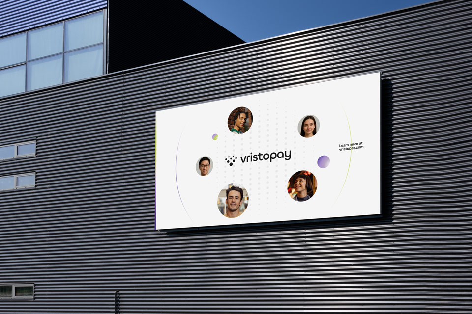
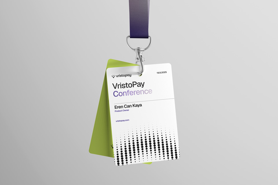
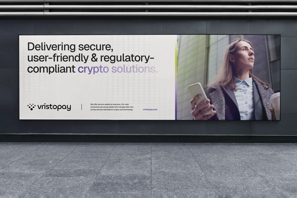
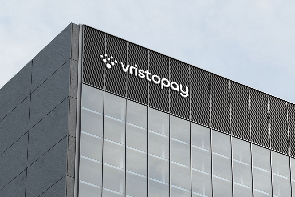
Vristopay
Crypto App Branding
Art direction, Graphic design, Logo animation
Graphic designer
Nemanja Baukov
Creative producer
Nađa Subakov
Animator
Mihailo Marković
Product owner
Eren Can Kaya

Between the jargon, the hype, and the sea of apps all promising to be the one, it’s easy to feel lost. Vristopay claims to have solved that. They bring clarity to the chaos of crypto. Smart, secure, bold, and super easy to use - these were the starting points for our design process. We wanted Vristopay to look like it works: clean, modern, and flexible.
The Logo
The rounded typography is there to strike a balance between digital precision and human warmth, setting the tone for a brand that’s serious about security — but never cold or complicated. The symbol represents people, cells, data, whatever you may see. Further, the circles are formed into a shape of a heart or a letter V.
Typography
We used Geist, a sans-serif typeface for readability and clarity. It embodies our design principles of simplicity, minimalism, and speed, drawing inspiration from the renowned Swiss design movement. Purple gradients are used to highlight important information, as seen in our tagline “Bridging the gap between digital assets and traditional finance”.
Color
The color palette - Eerie Black, Dark Slate Blue (purple), June Bud Yellow and Soap Pink — is what gives this brand a soft kick. It nods to the data-driven world of finance but keeps things light and modern, with a splash of brightness.
Dynamic Brand Device
The glowing, dot-matrix pattern is used across KVs in both static and motion. Our main idea was to create a system that will have a life of its own after we complete our part. That's why we used a generative approach: our brand device can be automatically generated through After Effects and it allows for infinite iterations, assuring consistency when adapting to new messages, icons, and campaigns. It gives the brand an endless flexibility.
Logo Animation
Vristopay is a living, breathing identity system ready to scale across any format. To put this in motion: we start with soft, fluid transitions that echo flow. As the dots assemble into the final logomark, it resonates Vristopay’s core promise: complex systems can feel simple.